Hey people, its day 4 of my blogging stream and although I had initially said I'd be doing the CoverGirl Flamed Out Shadow Sticks, one of mine was melted by the time I opened it and I lost the receipt so I'll have to see if Walmart will take it back anyways! So instead of that, I'll be doing the Maybelline EyeStudio Colour Pealrs Marbleized Eyeshadow in Downtown Denim. So I got this eyeshadow on a whim because Target and London Drugs had it on cleareance so I literally said, "why not?" :D
Packaging: I'm waiting for the day when I can say that the packaging is gorgeous like the Too Faced Pretty Rebel Palette (open the link and wow I just LOVE Too Faced's packaging for everything!!) So back to this, it's drugstore average AGAIN. Has the name, has the shade, and unlike the CoverGirl (CG) quad in Coffee Shop, the sticker with the name on it has a rippy thing so you don't have to peel the entire thing off! Yay.
So I opened the lid again for you guys and as you can see, there's two colours. The one on the left is a navy blue whereas the one on the right is a "marbleized" mix of light blue, gold and dark blue. Both shadows have shimmer but I find that it is slightly more noticeable on the navy blue side since the sparkle is so bright and the navy is so dark.
So the thing I forgot to mention earlier about packaging is that this product has the word pearl in its name. So therefore, Maybelline manufactured it as a dome shape. In my opinion, its pretty unique for drugstore shadows but now Sephora Collection's baked palettes are all dome-shaped so maybe not as cool as I originally thought.... Something worth noting for a drugstore product though!
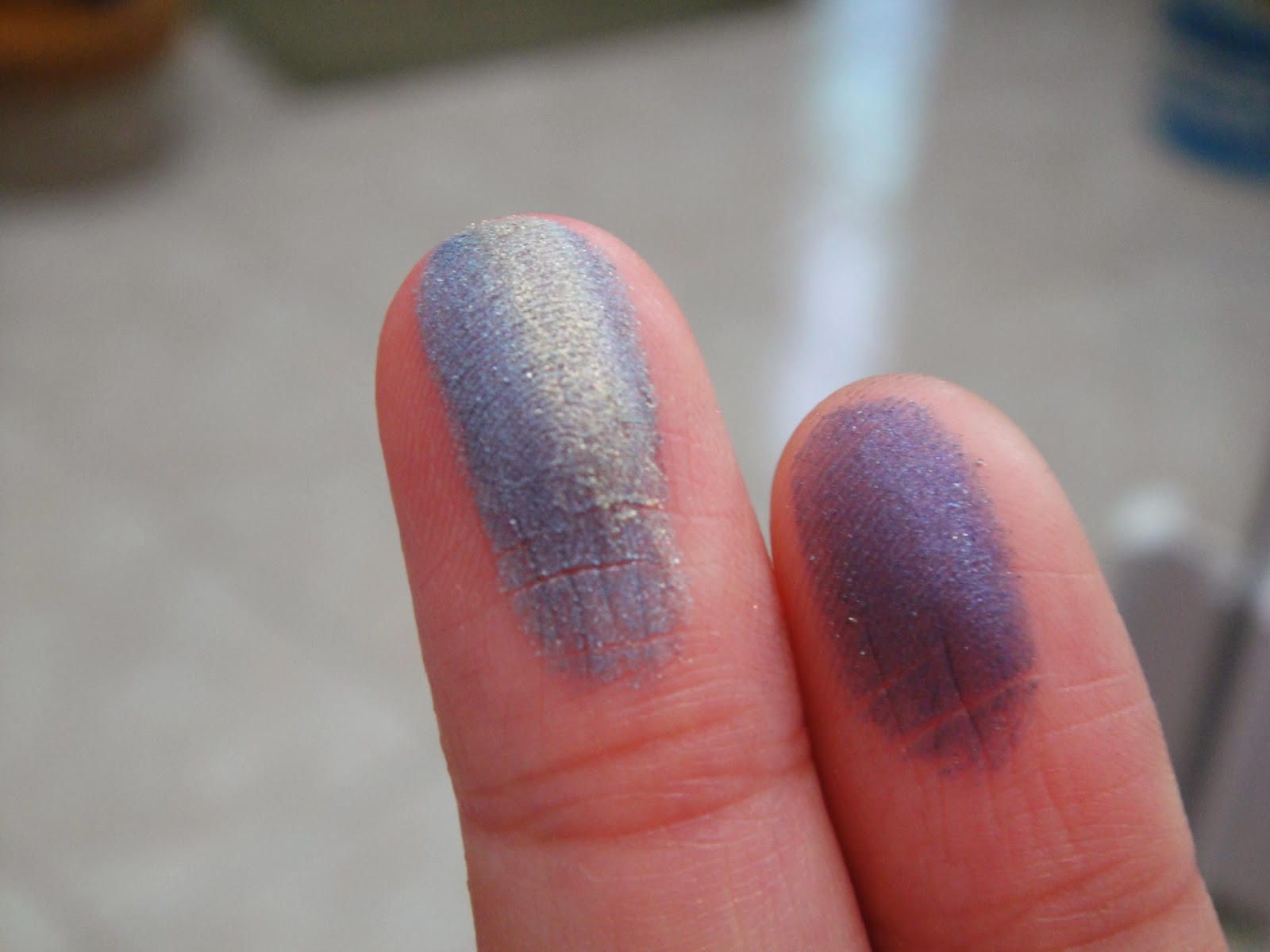
So since it's a dome, I felt like rubbing my fingers instead of tapping it so after rubbing it once or twice over the palette-thing, this is what my fingers looked like. Really nice and pigmented!I swatched it on my arm and this is what the pigment turned out with. As you can see, once you apply the light blue shadow, the gold just makes it seem more metallic and helps it stand out instead of being super prominent and contrasting like it seems on my finger.
To conclude (wow that's like english essay worthy), this is actually a nice duo in my opinion. The marbleized light blue/gold/navy on the right side isn't something you find very often, especially with drugstore brands, and I think this one is really pretty! The texture of the shadows isn't chalky and it's kind of powdery but that's okay :) The only cautionary thing I would say about this is that if you look at the very first picture, you can see that there's quite a bit of shimmer in the black plastic holding the duo so therefore there is a bit of fallout. But its honestly not too bad and the sparkles are so teeny you probably wouldn't notice anyway. I bought this at $4.89 at Target Canada when it was on sale a couple months ago but apparently its on sale right now for $2.98 at Target in the US and online... great..
I'm tired of giving scores out of 5 because that is so cliché and at the same time, it's one of those things I feel that reviewers should do, or at least we should have a stamp-like thing that says approved (inspired by Musings of A Muse) so I'll see what I can do on Adobe Illustrator (btw if you scroll up and you see my Maybe Makeup tree, I drew out every single point on Illustrator!! Took me an hour and a half but it was so worth it!) so I think by Monday or tomorrow, I'll have to come up with something different for you guys!
xoxo, Michelle


No comments:
Post a Comment